You have a pretty simple formula, with associated claims, and secondary issues. I went through all the main ones and as you can see, none correspond with Al Gore, James Hansen or any of the other cheerleaders from Ban-Ki Moon downwards who base their entire speeches on what I am about to present.
The temperature has been rising since leaving the little ice age a few hundred years ago, there is no certainty how much since CO2 increased in 1850 is natural but maybe 0.2-4C of a total of 0.8C. CO2 is meant to add 1C at 260ppm and 1C per doubling. It's risen 50% and including the existing rise would reach a relatively beneficial (according to the IPCC) 1.6C when doubling at the current trend. Those are the fairly knowns (as it is not a perfect science from past or present measurements).
More than that requires nearly all the additional rise from evaporated water vapour from the oceans, causing a higher rise. This indirectly hasn't happened, or the temperature would be significantly higher now, and direct satellite measurements confirm this, with no reason for this mechanism to change. Aqua satellite even found CO2 was replacing some water vapour at the vital bands causing negative feedback.
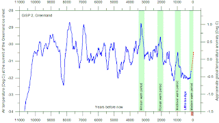
Then they claim the current warming is both unprecedented and faster than natural. Until you look back in the official historic records:
While cloud cover increases (presumably from the evaporating oceans) causing shade during the day and reducing the temperature overall.
The secondary claims are equally tested, extreme weather was not actually included by the UN, they simply said it is unlikely to increase in frequency, but possibly in intensity. But for those who say otherwise it hasn't.
The temperature was higher worldwide, before the UN altered their graphs some years ago, and then altered them again the other way a little last year, in the Minoan, Roman and Medieval Warm Periods. Records show unlike the claims made by those not able to support them (how can they till the temperature rises enough to know directly?) the world was a better place with more food, fewer deaths from cold (everyone dies from cold, only the old and weak from heat), and fewer wars and a higher birthrate. Written records exist from the most recent as well as plant records not possible to currently grow so far north. In fact until the 21st century there was little question the current temperatures was perfectly normal as (despite being cobbled from proxy records) it has been higher regularly within human lifetimes. Of course the proxy records potentially show no better they weren't warmer as well, due to their inherent weaknesses, but that isn't so reliable as they only just decided to fix it after it being the existing, to borrow one of their own terms, 'settled science'.
There are a few local and world graphs here which are virtually impossible to alter to be different when they have clearly stood for a long time as part of geological records.
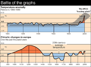
And even if you were to accept the most severe Mann version of the recent period, look how it melts away when put into context, and you discover the rise began over a thousand years ago, when we didn't emit much CO2.
Imagine the papers printing the hockey stick as part of geological history, people would have laughed it out of town. As anyone reading this should now.
However, the rule I outlined earlier, where climatology produces more than one diagram for the same periods, only one (if any) can be right. You can see long term the temperature always rises or falls, large and small ice age cycles and interglacial continue from start to present. So how and why have the little ice age and medieval warm period both vanished from Mann's hockey stick diagram, the one the entire UN policy and hence world policy is based on, when everyone else till then had used them? And how did the sudden rise coincide with the use of satellites in 1979?
Not only is this odd, against every other area of science, and clearly suspicious, the UN themselves used the lower diagram themselves till they replaced it. Although this applies to Europe and the Northern Hemisphere they still represent two identical periods and totally different results. That would also guarantee at the bare minimum the science of proxy temperatures before around 2000 when the new diagram totally replaced all others of the past besides in old textbooks, was clearly totally worthless, otherwise how could they have made such huge differences from what Michael Mann clearly found to be wrong. Or vice versa. As I say, science comes below logic. An unreliable witness makes the identical slipups whichever field they represent, and a good investigator will always spot these long before the general public. The IPCC themselves used the old diagram so how can there be a problem now compared to that? Of course there couldn't be, so someone had to fix it, knowing only a handful of people would notice and even fewer would care.
In fact Ross McKitrick demonstrated Mann simply took the same data and fiddled with it. Here's the before and after, and the before Mann got to it, or after McKitrick undid it, it starts to look just like it did before. Fancy that.
More details
Mathematical proof?
I could trawl my way through all the minor issues as well, like the absence of hurricane activity for years, sea level rise barely increasing from the 20th century (maybe 30% higher in rate, enough to add a whole four more inches than it rose the previous century, and not really challenged by the UN who only use a metre or so range meaning they don't really expect the temperature to rise that much) while James Hansen says it will rise 3-6 metres but not till 2080 or so suddenly, with not a single authority to defend the view and a very few people alive today who will ever know it. Even though the Arctic ice (10% of the total) is reducing, the Antarctic is increasing, meaning the sea ice at least is not even changing. Land ice is a different matter, but as you can't really measure the depth beyond a short level (ask Pen Hadow, who was sent to drill manually and the equipment couldn't even manage it) their claims are to be taken with a pinch of salt, although the latest surface measurements, a proxy for the total depth, show it to have fallen and now recovered.
"In a press release ESA announced that the measurements from their 2010-2011 campaigns show the height of Antarctic ice to be an average of nine centimetres higher than the measurements obtained during the 2008-2009 campaigns."
"According to the ESA press release, there was a five cm drop of the height of Antarctic ice from 1991-2000 that continued until 2008. ESA does not yet have information explaining why the ice height has increased, but are encouraged at the possible upward trend."
The secondary material supports the primary, and each claim added by the warm brigade has also been put through the same testing process, often taking only a few minutes by doing a search and checking a few representative results. These foundations, basically only requiring water vapour to increase or global warming must be restricted to maybe 2C at a virtually impossible 1000ppm CO2, over a timescale where we would both be able to discover an alternative to fossil fuel anyway, and maybe teach (or legislate) people not to build on flood plains to guarantee the least effects from the slight rise in sea level we are currently experiencing with no known causes I could find to add to the rate.
The known results of what till recently were accepted as previous periods of warmer temperatures are all positive, so how they can claim disaster when even a 2-4C rise won't add enough sea level rise to reduce coastlines by a few hundred yards maximum (I read the formula recently, as the ice is known to contribute directly to sea level rises per 1C rise plus the equal thermal expansion anything more than the 1-3 foot range only the outliers like Hansen and Greenpeace ignore are possible. The temperature rose 0.8C and the sea level rose under a foot, so that gives a ballpark figure per 1C or so, as unless you want to believe in Hansen's personal scientific system, these are linear.
The major contradictions so far offered to my presentations that even warranted further research (ie not formulas which did not apply, speculation or statements of authority) at best simply produced differing graphs produced for the same period, addressed in another entry here with some samples, which only demonstrated how easy it is to either get things wrong when measuring the climate (as obviously only one graph per set can be right while the others aren't), or as in the case of the temperature records per region, add some warming after measuring they weren't, which is a crime.
But unless there's positive feedback, based on water vapour increasing, the game's off. No past records of higher or lower count at all, they are only countering the nonsense that today's temperatures are any sort of records, or the rate of rise. And when you do look back to the best proxies history can do, they blow away every single secondary claim in one go. The conclusion has to be whichever global warming road you look up to find it they all end in cul de sacs. There is not a single route which takes you there, at best one may get you lost or in a dead zone like a limbo, but none actually demonstrate the conditions required to break 2C or even close.
Antarctic land ice increases
The primary issue here isn't which graph is right (for a change) but the existence of too many alternatives. I wouldn't want to be a patient in hospital with so many opinions on my health, and neither a taxpayer whose taxes depend on said graphs. If science wants a wankfest then good luck to them, but NOT when world policy is then based on it. And they chose the expensive one of the two, fancy that.


Nicely done David, very comprehensive.
ReplyDeleteSo man made CO2 caused global warming is a hoax, granted.
The reason, as we both had concluded, political : the establishment of a single Global Govt. I came across this video this morning. Alan Watt has done plenty of research :
www.youtube.com/warch?v=VllwRgSECcw
Or, put in search box : Alan Watt - A Globalist Agenda For a Dumbed Down Domesticated Society - A Prison Planet special
1 hr 59.55 mins.
Meshes perfectly, as far as I can see, with the book Pawns in the Game, by William Guy Carr.
Sorry.
Deletewww.youtube,com/watch?v=VllwRgSECcw
Thanks John, the truth is all around us, I've done interviews on the one world government and have quite a few entries on it including draught legislation. One by one they are reaching themselves too far and it's only a matter of getting the real material to the people in great enough numbers for them to get it and let the illusion go.
Delete